Marketez
Agency Rebrand & Digital Experience

Marketez is a creative marketing agency built around making marketing easier for brands. The project was a complete rethink of how the agency presented itself, from its logo and visual language to motion, social content and its digital experience. The identity grew from one simple idea, “Market with Ease.” Rather than treating that as just a tagline, I used it as the basis for the wider brand system, creating an identity that could move consistently across the agency's website, social presence and promotional content.
Client
Marketez
Role
Brand & Digital Designer
Year
2024
Deliverable
Brand Identity
UI/UX Design
Motion Graphics
Social Content
Brand Identity
The identity started with the agency's positioning, “Market with Ease.” I pulled “EZ” out of the Marketez name and made it the centre of the mark, turning the idea of ease into something that could be recognised visually rather than simply stated in copy.
The larger ‘M’ forms the structure around it, allowing the compact EZ mark and the full identity to work at different scales across digital applications.
The website was designed as an extension of the identity rather than a separate piece of work. The same black-and-white palette, typography, curved forms and oversized graphic elements move into the interface, giving Marketez a consistent experience from its social presence through to its main digital platform.
Brand In Application

The visual language was extended into the agency's social presence using oversized typography, high-contrast compositions and messaging built around the EZ concept. “Marketing made EZ” became a simple extension of the positioning and gave the brand a recognisable voice beyond the logo itself.
Digital Experience
From Identity to Interface
Identity In Motion
Motion gave the identity another way to behave across digital platforms. The promo brings together the logo, typography and graphic system through movement, creating a short-form introduction to the agency designed for social and promotional use.

A Small Interaction With a Big Role


Instead of using a conventional full-width navigation bar, I designed a compact floating menu inspired by the behaviour and form of Apple's Dynamic Island. It keeps the interface minimal while creating a recurring element that remains recognisable across the site.
Making the Process Visible
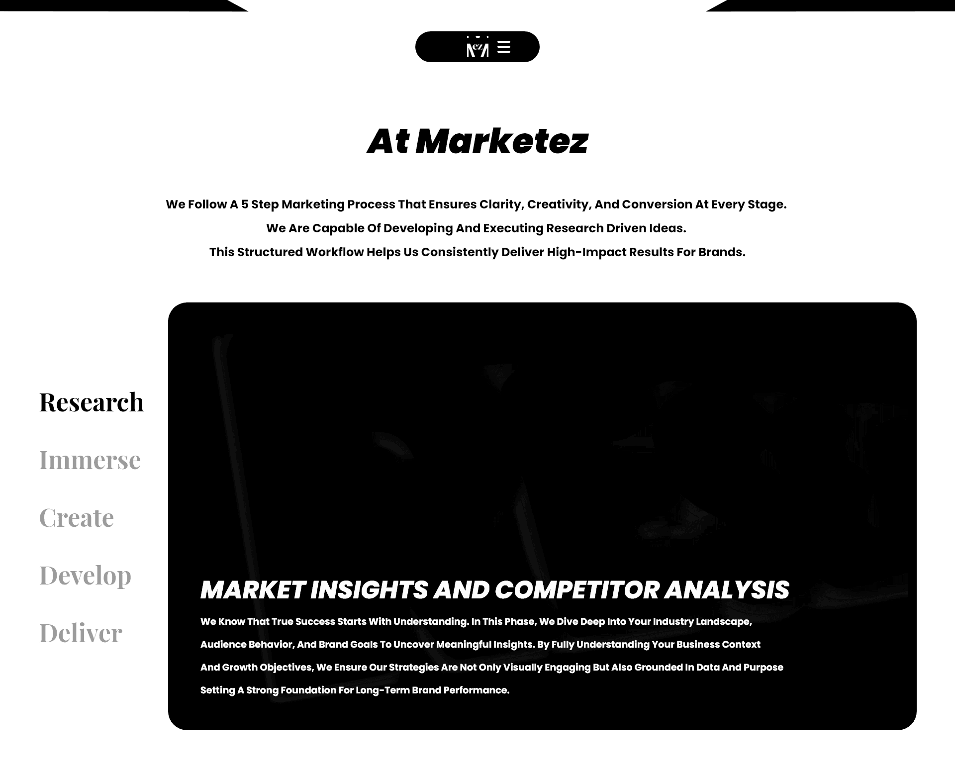
The Process page turns Marketez's five-stage workflow, Research, Immerse, Create, Develop and Deliver, into part of the browsing experience. Rather than presenting the methodology as a long block of text, each stage becomes a navigable section with its own visual treatment, making the agency's way of working easier to understand.
From Browsing to Enquiry
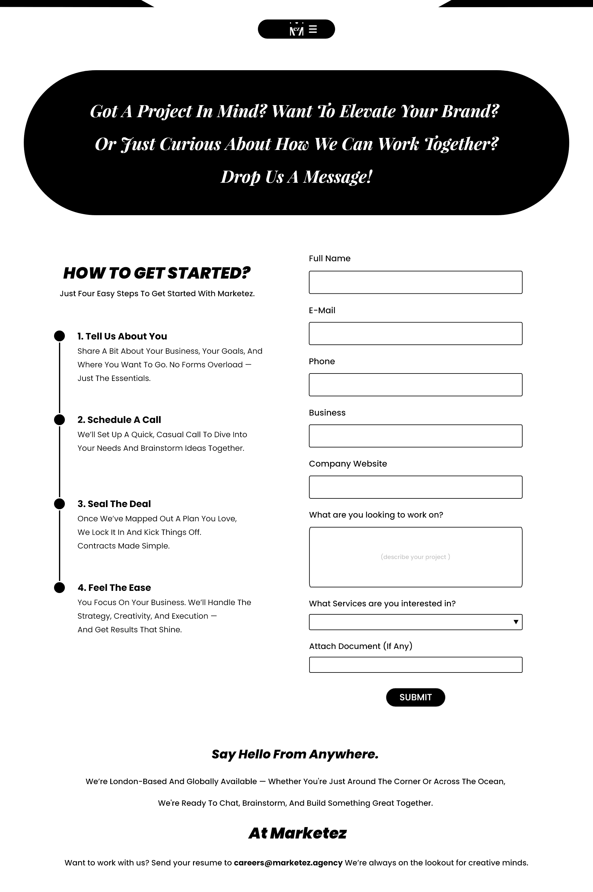
The contact experience was designed around reducing friction between interest and enquiry. The page explains the steps of working with Marketez alongside a structured project form, giving potential clients a clear idea of what happens next while collecting the information the agency needs to start a conversation.
Creative Process -
Challenge
Marketez needed more than a new logo. The challenge was to create a visual identity flexible enough to represent the agency across multiple touchpoints, while giving a relatively young brand a clearer personality and making its digital experience feel consistent with the way it positioned itself: simple, confident and easy to work with.
Approach
I built the identity around “Market with Ease,” extracting the EZ from the Marketez name and turning it into the focal point of the logo. From there, I developed a high-contrast visual language built around black and white, oversized typography, bold proportions and simple graphic forms. Rather than stopping at the identity, I carried the same system into social content, motion and the website. The digital experience introduced its own interaction language through compact navigation, pill-shaped elements and large editorial layouts, while pages such as Process and Contact were structured around making information easier for prospective clients to understand and act on.
Outcome
The result is a connected identity and digital system rather than a collection of separate assets. The logo establishes the central EZ idea, social and motion give it a voice, and the website turns the same visual language into a functional experience for potential clients.
Marketez
Agency Rebrand & Digital Experience
Marketez is a creative marketing agency built around making marketing easier for brands. The project was a complete rethink of how the agency presented itself, from its logo and visual language to motion, social content and its digital experience. The identity grew from one simple idea, “Market with Ease.” Rather than treating that as just a tagline, I used it as the basis for the wider brand system, creating an identity that could move consistently across the agency's website, social presence and promotional content.
Client
Marketez
Role
Brand & Digital Designer
Year
2024
Deliverable
Brand Identity
UI/UX Design
Motion Graphics
Social Content
Brand Identity
The identity started with the agency's positioning, “Market with Ease.” I pulled “EZ” out of the Marketez name and made it the centre of the mark, turning the idea of ease into something that could be recognised visually rather than simply stated in copy.
The larger ‘M’ forms the structure around it, allowing the compact EZ mark and the full identity to work at different scales across digital applications.
The identity started with the agency's positioning, “Market with Ease.” I pulled “EZ” out of the Marketez name and made it the centre of the mark, turning the idea of ease into something that could be recognised visually rather than simply stated in copy.
The larger ‘M’ forms the structure around it, allowing the compact EZ mark and the full identity to work at different scales across digital applications.
Brand In Application
The visual language was extended into the agency's social presence using oversized typography, high-contrast compositions and messaging built around the EZ concept. “Marketing made EZ” became a simple extension of the positioning and gave the brand a recognisable voice beyond the logo itself.
The visual language was extended into the agency's social presence using oversized typography, high-contrast compositions and messaging built around the EZ concept. “Marketing made EZ” became a simple extension of the positioning and gave the brand a recognisable voice beyond the logo itself.
Identity In Motion
Motion gave the identity another way to behave across digital platforms. The promo brings together the logo, typography and graphic system through movement, creating a short-form introduction to the agency designed for social and promotional use.
Motion gave the identity another way to behave across digital platforms. The promo brings together the logo, typography and graphic system through movement, creating a short-form introduction to the agency designed for social and promotional use.
Digital Experience
From Identity to Interface
The website was designed as an extension of the identity rather than a separate piece of work. The same black-and-white palette, typography, curved forms and oversized graphic elements move into the interface, giving Marketez a consistent experience from its social presence through to its main digital platform.
A Small Interaction With a Big Role
Instead of using a conventional full-width navigation bar, I designed a compact floating menu inspired by the behaviour and form of Apple's Dynamic Island. It keeps the interface minimal while creating a recurring element that remains recognisable across the site.
Making the Process Visible
The Process page turns Marketez's five-stage workflow, Research, Immerse, Create, Develop and Deliver, into part of the browsing experience. Rather than presenting the methodology as a long block of text, each stage becomes a navigable section with its own visual treatment, making the agency's way of working easier to understand.
From Browsing to Enquiry
The contact experience was designed around reducing friction between interest and enquiry. The page explains the steps of working with Marketez alongside a structured project form, giving potential clients a clear idea of what happens next while collecting the information the agency needs to start a conversation.
Creative Process -
Creative Process -
Challenge
Challenge
Marketez needed more than a new logo. The challenge was to create a visual identity flexible enough to represent the agency across multiple touchpoints, while giving a relatively young brand a clearer personality and making its digital experience feel consistent with the way it positioned itself: simple, confident and easy to work with.
Marketez needed more than a new logo. The challenge was to create a visual identity flexible enough to represent the agency across multiple touchpoints, while giving a relatively young brand a clearer personality and making its digital experience feel consistent with the way it positioned itself: simple, confident and easy to work with.
Approach
Approach
I built the identity around “Market with Ease,” extracting the EZ from the Marketez name and turning it into the focal point of the logo. From there, I developed a high-contrast visual language built around black and white, oversized typography, bold proportions and simple graphic forms. Rather than stopping at the identity, I carried the same system into social content, motion and the website. The digital experience introduced its own interaction language through compact navigation, pill-shaped elements and large editorial layouts, while pages such as Process and Contact were structured around making information easier for prospective clients to understand and act on.
I built the identity around “Market with Ease,” extracting the EZ from the Marketez name and turning it into the focal point of the logo. From there, I developed a high-contrast visual language built around black and white, oversized typography, bold proportions and simple graphic forms. Rather than stopping at the identity, I carried the same system into social content, motion and the website. The digital experience introduced its own interaction language through compact navigation, pill-shaped elements and large editorial layouts, while pages such as Process and Contact were structured around making information easier for prospective clients to understand and act on.
Outcome
Outcome
The result is a connected identity and digital system rather than a collection of separate assets. The logo establishes the central EZ idea, social and motion give it a voice, and the website turns the same visual language into a functional experience for potential clients.
The result is a connected identity and digital system rather than a collection of separate assets. The logo establishes the central EZ idea, social and motion give it a voice, and the website turns the same visual language into a functional experience for potential clients.